

Investment leaders may see the same portfolio figures across board decks, monthly reports, and multiple reporting tools. Occupancy, cash flow, returns, and budget variances are all there. What is harder to get from that reporting is a quick understanding of what changed, whether it matters, and which asset or market deserves attention next.
A reporting screen shows the numbers. A decision tool helps an executive interpret them: what moved, how significant the movement is, what is driving it, and where to investigate next.
The goal is to connect the right metrics, context, and drill-down path to the decisions leadership needs to make.
A useful executive dashboard starts with those decisions, then works backward to the metrics, data, and interface required to support them. This is the principle behind effective custom data visualization for real estate investment reporting.
This is how ORIL approaches custom data visualization: starting with the reporting decisions the dashboard needs to support, then designing the visualization and supporting data structure around them.
Key takeaways
- Executive dashboards should prioritize material movements and exceptions, with deeper operational detail available when an investigation requires it.
- For many organizations, executive investment reporting can be organized around four areas: portfolio health, financial performance, risk and exceptions, and capital and investment performance. The exact metrics depend on strategy and role.
- A metric becomes more useful for executive reporting when it is paired with a relevant comparison, materiality, and a path to underlying detail.
- Progressive disclosure keeps the top view focused while giving access to asset, property, and source-level detail when an investigation calls for it.
- Role-based views let executives, investment teams, asset managers, and finance teams work at different levels of detail while keeping shared metric definitions consistent.
- Custom engineering is worth considering when KPI logic, integrations, permissions, or cross-system drill-down cannot be handled cleanly by the existing BI and data stack.
Why More Dashboard Data Doesn’t Mean Better Decisions
The difference becomes clearer when the dashboard contains more information than an executive can reasonably interpret at once. When occupancy, revenue, cash flow, and operating metrics all carry similar visual weight, a material movement becomes harder to distinguish from routine performance.
A single number also carries little meaning on its own. A net operating income (NOI) figure, for instance, is only interpretable against a relevant reference point:
- the prior period
- the budget
- the underwriting assumption
- comparable assets
The right comparison depends on the question the metric is meant to answer. This makes metric selection part of the business analysis process that precedes chart selection.
Real estate data commonly spans property, investment, operational, and third-party systems, often with different structures and identifiers ( EY). Those relationships need to be resolved so the same metric remains consistent as users move between portfolio, asset, and property views.
What Should an Executive Real Estate Investment Dashboard Answer?
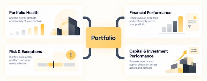
Rather than starting from a KPI catalog, it helps to start from the questions leadership needs answered. For many investment organizations, these questions can be grouped into four broad areas: portfolio health, financial performance, risk and exceptions, and capital and investment performance.
Which metrics populate each area depends on the mandate. A core-plus fund, a value-add operator, and a diversified REIT weigh occupancy, leverage, and returns differently, so a dashboard structure that works for one strategy may need significant changes for another. The dashboard structure should therefore reflect the organization’s investment strategy and reporting requirements rather than follow a universal KPI template.
The four areas map to different executive questions and metric sets.
| Area | Core question | Example metrics |
| Portfolio health | Where is the portfolio exposed, and how is it tracking overall? | Exposure, asset and geography mix, portfolio trend, relative performance |
| Financial performance | What is driving the financial result? | Revenue, expenses, NOI, cash flow, budget vs. actual |
| Risk and exceptions | Which assets need closer review, and why? | Vacancy, delinquency, covenant headroom, expense variance |
| Capital and investment performance | Is the portfolio delivering against its objectives? | Asset value, total return, yield or cap rate, internal rate of return (IRR) |
Portfolio Health
Portfolio health answers where the portfolio is exposed and how it is tracking overall. At this level, leadership reads exposure and the asset or geography mix, the portfolio trend, and relative performance across holdings, rather than the individual financial lines behind them.
Exposure is the core of this view. Changes in sector, geography, or asset-type mix can alter the portfolio’s risk profile even when headline returns look stable, so tracking exposure alongside performance helps executives separate operating changes from broader shifts in composition.
Financial Performance
Financial performance answers what is driving the financial result. It covers revenue, expenses, NOI, cash flow, and budget versus actual, and it can easily expand into operational reporting if the executive view is not selective.
That view should emphasize the metrics that explain material movement rather than reproduce the full operating report. A revenue figure means more when paired with its variance to budget and its trend over time. Physical and economic occupancy can also diverge. Showing both helps explain why revenue or NOI may move differently from physical occupancy alone, particularly when concessions, collections, or other factors affect realized income.
Risk and Exceptions
Risk and exceptions gives leadership a way to identify which assets warrant closer review without a manual scan of the entire portfolio. Common examples include:
- a vacancy trend that breaches a threshold
- rising delinquency
- an unexpected expense
- a covenant metric approaching its limit
For many executive views, prioritizing exceptions by materiality is more useful than presenting an undifferentiated list of risks. A 2% variance on a small asset and a 2% variance on the largest holding are not equivalent, and an exception-first layout reflects that weighting.
Capital and Investment Performance
Capital and investment performance answers whether the portfolio is delivering against its objectives. Depending on strategy, that can include asset value, total returns, yield or cap rate, IRR, and other measures used in the organization’s underwriting and performance framework.
These metrics lose meaning as universal targets. A stabilized core asset and an opportunistic development carry different return expectations, so comparison against each asset’s plan can be more informative than applying a single return target across materially different assets.
What Makes a Metric Worth Acting On
A KPI gives you a value. Executive reporting has to make that value interpretable. For a metric that has moved materially, the dashboard should make five things clear:
- What changed: the movement in the metric
- Compared with what: the prior period, budget, underwriting, or a benchmark
- How material: whether the change is large enough to matter, judged against a defined threshold
- Why it matters: the effect on returns, cash flow, exposure, or a covenant
- Where to look next: the asset, market, or property to investigate
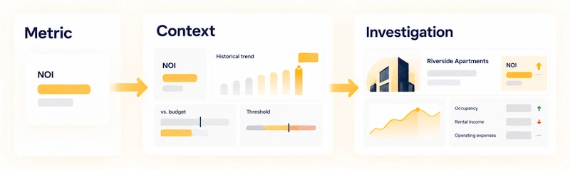
With those five in place, a reported value becomes something the reader can investigate. The table below is illustrative, using placeholder values.
| Raw metric on a dashboard | The same metric, in context |
| Occupancy: 91% | Occupancy down four points against budget at one asset, the largest contributor to the portfolio variance this quarter |
| NOI: on plan overall | NOI running under plan at two assets on rising operating expenses, offset elsewhere |
| Delinquency: 3.1% | Delinquency up from the prior quarter at one property; that property’s debt-service coverage ratio (DSCR) is also approaching its covenant threshold |
These principles turn a reported value into an actionable signal: executives can see what changed, understand its significance, and move directly to the level of detail needed to investigate it.
Progressive Disclosure: How Executives Drill Into Detail
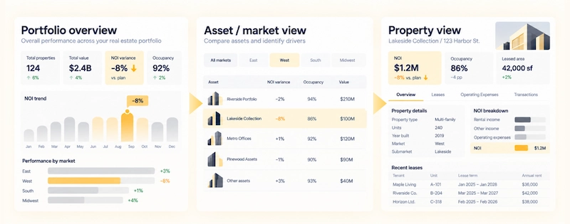
Progressive disclosure is an interaction model where the interface shows the information most relevant to the question at hand first and reveals additional detail only on request. For an executive dashboard, it keeps the top view uncluttered while preserving a path to the underlying numbers.
The C-Level Portfolio View
The first layer holds portfolio health, major financial indicators, investment performance, and material exceptions. Operational detail stays out unless it materially affects an executive decision. The aim is to give leadership a focused view of what requires attention at portfolio scale.
Asset and Market Drill-Down
One level down, the aim is to explain a portfolio-level movement through the assets or markets behind it. At this layer, an executive can:
- identify which assets or markets are driving it
- compare an asset against peers or its own plan
- measure its contribution to the portfolio-level variance
Property-Level Investigation and Data Traceability
At a single property, the questions become concrete. The number above usually resolves to:
- lease events, such as renewals or expirations
- expense lines that moved against budget
- transactions tied to the asset
Just as important is traceability, the ability to follow a reported figure back to the records and calculations that produced it.
This progression lets executives move from a portfolio-level signal to the evidence needed to understand it, without overwhelming the initial view.
Role-Based Views on Shared Definitions
A CFO, an asset manager, and an investment lead each need a different level of detail, but they should not end up with different versions of the same number. Role-based views give each role its own depth and framing while the metric definitions stay shared, so NOI means the same thing on the executive view and on the asset manager’s screen.
| Role | Typical primary view | Typical depth |
| C-level | Portfolio performance and exceptions | High-level |
| Investment leaders | Asset performance and returns | Portfolio to asset |
| Asset managers | Property-level operating drivers | Asset to property |
| Finance | Financial and accounting detail | Property to transaction |
The point is to let each role work at the depth it needs while preserving a consistent meaning for the metrics that connect those views. When definitions remain consistent, an executive can move from a portfolio signal to an asset or property view without having to question whether the underlying number has changed.
What Executives Should Be Able to Read at a Glance
Once the reporting logic is defined, visualization determines how quickly an executive can understand it.
A useful visual hierarchy makes the important signal visible first, gives it enough context to interpret the movement, and keeps the next level of detail accessible without overwhelming the initial view. A trend line can show direction, a variance bar can show performance against plan, a ranking can show relative standing, and a threshold can surface an exception.
The chart type itself is secondary. What matters is whether the visual helps the executive recognize the relevant signal and understand what deserves attention.
Visualization is therefore not decoration around the reporting logic, but the layer that determines how quickly that logic can be understood.
When a Real Estate Investment Dashboard Needs Custom Engineering
Not every executive dashboard needs custom software. A BI tool over a well-structured data environment can be enough when:
- data is already consolidated
- KPI logic is straightforward
- permissions are simple
- drill-down does not cross systems
Custom engineering becomes relevant when:
- multiple systems need to be reconciled
- property or entity resolution is required
- KPI logic is complex or role-specific
- permissions differ by role
- executives need traceability across systems
- the dashboard becomes part of a broader analytics product
The visualization layer carries its own share of the work: showing the right metric at the right level, making exceptions and variances visible without clutter, holding definitions steady as a user drills down, and staying responsive as data refreshes. That is where our custom data visualization services focus, on top of the data model rather than in place of it.
What Has to Exist Behind the Visualization
The supporting layer behind an executive dashboard has to hold up under scrutiny. Metric definitions, calculation logic, source relationships, permissions, and refresh rules all need to remain consistent as users move from a portfolio view to an asset, property, or underlying record.
That consistency is what makes the visualization useful. A portfolio variance should reconcile to the assets behind it. A property-level result should retain the same definition used in the executive view. When those relationships are unclear or unstable, the interface may look polished but still leave users questioning the number.
ORIL brings the data and visualization layers together when the reporting requirements demand it. The objective is not to expose the underlying complexity, but to make the relevant relationships clear enough for executives to assess performance, investigate exceptions, and move to the next level of detail with confidence.


