

Quick answer: A single portfolio view depends on the data and reporting infrastructure underneath it. Real estate investment dashboards work best when they draw from a governed data layer rather than a stack of monthly Excel exports. That layer comes from integration, normalization, and automated pipelines that pull occupancy, net operating income (NOI), valuations, and returns from your PMS, accounting, and CRM systems, and standardize them once so the portfolio view stays consistent across every reporting cycle.
Ask a simple question about a multi-property portfolio, such as which assets dragged NOI down this quarter, and the answer may take days.
The data may be distributed across the PMS, accounting, CRM, and analyst models, with the final portfolio figure depending on which version has been reconciled and approved for that reporting cycle.
At ORIL, we approach this as a data and software architecture problem: connecting the systems that hold portfolio data and creating a consistent layer for reporting and analysis.
Why Portfolio Reporting Still Starts in Excel
Excel remains useful for underwriting, scenario analysis, and one-off modeling because analysts can change assumptions quickly without waiting for a formal development cycle. The problem begins when a workbook designed for individual analysis becomes the recurring reporting mechanism for a growing portfolio.
Excel also handles the messy middle of investment work well: testing a new return calculation, sketching a hold-period assumption, or comparing two acquisition scenarios before anything is formalized. Much early investment financial management software has to support exactly this kind of ad hoc modeling, and spreadsheets do it with almost no setup.
The tool is not the issue. Trouble starts later, when a workbook built for one analyst and a handful of properties becomes the reporting system for a growing portfolio.
Where Spreadsheet-Based Portfolio Reporting Starts to Break
Portfolio complexity grows on several axes at once: more properties, more legal entities, more source systems, more contributors, and more reporting cycles. Without a shared data model, each addition creates another point where data can diverge.
As portfolios scale across systems, static workbooks stop staying in sync with the property management platforms and accounting tools that own the underlying records. A workbook can also become outdated between export and reporting if the underlying source data changes during the cycle.
In the 2026 NAREIM Technology, Data & AI Survey, conducted with Juniper Square, institutional real estate professionals rated their own data quality at 6.2 out of 10 (72 professionals across 38 firms). The result highlights a broader challenge: even organizations investing in new analytics capabilities may still be working with inconsistent or incomplete data foundations.
Manual Consolidation Is the Hidden Reporting Cost
The reporting cycle often includes substantial work before the final numbers are ready for analysis. A typical monthly cycle runs something like this:
1.Collect exports from PMS, accounting, and CRM, plus analyst workbooks.
2.Clean formatting, headers, and inconsistent labels.
3.Match property and entity records across sources.
4.Reconcile figures that should agree but do not.
5.Recalculate portfolio metrics and roll-ups.
6.Format a presentation-ready report and distribute it.
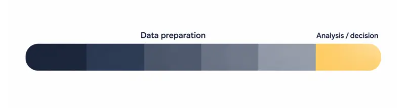
Only the final step is directly visible to the decision-maker. The preceding work is largely data preparation, reconciliation, and reporting operations that can consume time without changing the underlying investment decision. The rest is preparation, and it usually falls on the analysts who could otherwise be evaluating asset performance.
Across monthly and quarterly cycles, those manual steps can become a meaningful operational cost. At that point, teams can evaluate whether process changes, BI tooling, or custom data infrastructure would provide the right level of automation and control.
Version Control Creates Conflicting Numbers
As more contributors edit or reuse reporting workbooks, maintaining a single authoritative version becomes harder, particularly when files are copied or assumptions are maintained outside a controlled data model.
The reporting cycle then includes another reconciliation step to determine which value and assumptions should be used.
Different Systems Create Different Versions of the Same KPI
Even with clean version control, the same metric can carry different values depending on where it came from:
- Occupancy might be physical in the PMS and economic in an analyst model.
- NOI might include or exclude certain recoveries.
- Operating expenses might be categorized one way in accounting and another way in a workbook.
- Cap rate can differ when sources assume a different valuation basis for the same asset.
These are definition problems, and they sit in the data model long before they reach the dashboard. A visualization layer generally should not be responsible for resolving these differences.
Because the same business concept can be represented differently across systems, reconciliation needs to happen upstream of the dashboard. The team has to define the target metric, map the relevant source fields, and establish how differences between systems should be handled.
Stale Data Delays Portfolio Decisions
Manual reporting has a built-in lag. Source data keeps changing during the days it takes to collect, reconcile, and format a report, so the finished portfolio view can be outdated the moment it is published.
For investment teams, that lag has consequences. Manual reporting can delay the point at which teams see changes in occupancy, expenses, or other portfolio indicators, particularly when source data and reconciliation arrive at different times. Continuous visibility into portfolio performance is a core part of real estate investment intelligence, and it is difficult to achieve when every refresh is a manual event.
The Transformation: From Spreadsheet Consolidation to a Single Portfolio View
The goal is to move recurring portfolio reporting onto infrastructure that automates routine data preparation and refreshes while remaining observable and maintainable, with spreadsheets still available for the work they handle well. The target architecture can be viewed as five connected layers, each addressing a specific failure point in the manual reporting process.
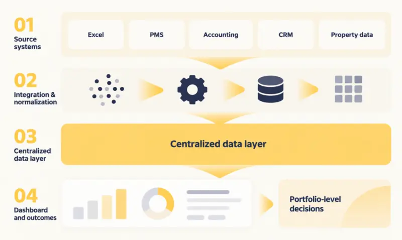
Each layer below solves a specific failure in the manual process. The sections that follow walk through them in order.
1. Connect the Systems That Hold Portfolio Data
Integration connects each source to the data pipeline using the most appropriate mechanism for that system: APIs where available, scheduled exports where necessary, and file ingestion for spreadsheet-based sources.
Each system joins the pipeline using the integration method that provides the required reliability, access, and refresh frequency for that source. Reliable automated real estate data integration across PMS, accounting, and CRM is the foundation the rest of the platform depends on.
Integration is more than copying data on a schedule. Each source needs its own operational rules:
- Defined ownership.
- A set refresh frequency.
- Error handling for failed loads.
- Monitoring, so a broken feed surfaces before it reaches a report.
Older accounting systems may require additional extraction or integration work when they lack modern APIs or other convenient interfaces. In some cases, a database migration or replication layer may also be appropriate, depending on the system architecture and reporting requirements.
2. Normalize Portfolio Data Before Building Dashboards
Connected data is not yet comparable data. The same property can appear under three identifiers across three systems. Property types, unit statuses, date formats, and financial categories all vary by source. Without standardization, those differences can lead to duplicate records, inconsistent aggregation, and misleading portfolio totals even when the dashboard itself looks unified.
The data model establishes common identifiers and representations, while metric governance defines how portfolio KPIs should be calculated and interpreted.
| Raw inconsistency | Normalized result |
| One property under several system IDs | A single canonical property and asset ID |
| Status values that differ by source | A shared status vocabulary |
| Divergent chart-of-accounts entries | Standardized financial categories |
For portfolios that span markets and vendors, entity matching gets harder as the source count grows. That reliability is a problem of data normalization at scale. Entity matching becomes more difficult as source systems, markets, naming conventions, and data quality vary.
3. Build a Centralized Data Layer for Portfolio Analytics
The centralized data layer sits between operational systems and the dashboard. It holds a consistent analytical representation of portfolio, asset, property, financial, and operational data, modeled around how the investment team actually reports.
A common portfolio model might represent relationships between portfolio, asset, property, and unit, with the exact hierarchy adapted to how the investment organization defines ownership, assets, and reporting entities.
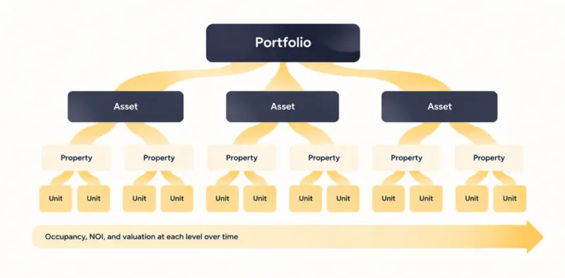
A well-defined data model helps the dashboard aggregate measures consistently and reduces the risk of duplicate or incorrectly attributed records.
This layer does not replace the PMS or the accounting system. Those remain the systems of record. The centralized layer reads from them and organizes the result for analysis.
4. Automate the Reporting Data Pipeline
Automation reduces the recurring manual preparation required to refresh portfolio reporting. Scheduled jobs pull new data, apply the normalization logic, validate it against expected ranges, and update the centralized layer while reducing the need for analysts to perform routine exports and transformations manually.
A dependable pipeline runs several checks on its own:
- Handles incremental updates.
- Retries failed loads.
- Flags anomalies.
- Records data freshness, so the dashboard can show when each figure was last refreshed.
How and where these jobs run is part of the cloud infrastructure deployment that supports the platform. Automation does not correct flawed reporting logic. Before scheduling the pipeline, teams should validate the definitions, mappings, reconciliation rules, and exception handling that determine the output.
5. Turn the Data Layer Into an Investment Dashboard
With governed metrics in place, dashboards can use consistent definitions of key measures while allowing each view to present the level of detail relevant to its users. Filters, drill-downs, historical trends, and variance analysis all draw from one source. Purpose-built real estate data visualization turns those governed metrics into views an investment team can act on.
Design still matters at this layer. Dense financial data has to stay scannable, and portfolio, asset, and property views have to connect logically so a user can move between levels without losing context. UI/UX design then determines how clearly users can move between portfolio, asset, and property views without losing context.
One Portfolio Data Layer, Different Views for Different Roles
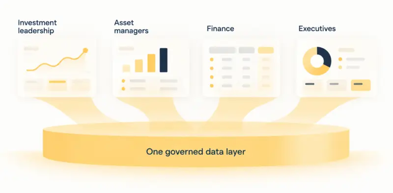
Different stakeholders need different reads on the same governed data. A shared data foundation can support these different views without requiring each team to maintain its own reporting dataset.
| Role | Primary view |
| Investment leadership | Portfolio performance, returns, and exceptions |
| Asset managers | Property-level performance and operational drivers |
| Finance | Revenue, expenses, and financial KPIs |
| Executives | High-level portfolio health and outliers |
The shared model gives the organization a common definition for governed KPIs, while each role can see the metrics and level of detail relevant to its work.
Controlled views for different user types build on the same engineering used for a research analytics platform, where access and context change by user while the underlying data stays consistent.
What a Decision-Ready Portfolio Dashboard Should Answer
A useful dashboard is defined by the decisions it supports, not by the number of charts it contains so the design should start from the questions an investment team asks every cycle:
- Which assets are underperforming against plan?
- Where is NOI declining, and what is driving it?
- Which properties are creating portfolio-level variance?
- How has occupancy changed since the last period?
- Which markets are outperforming?
- Which assumptions from the original underwriting are driving the gap between expected and actual performance?
- What changed since the previous reporting cycle?
Each question maps to metrics and drill-downs the data model has to support directly.
For example, our team built the Robins & Morton enterprise innovation dashboard, which centralized the company’s innovation management and its analytics in one platform and integrated with the IT systems it already ran. The use case is different, but the underlying architectural principle is relevant: centralize fragmented operational data in a platform that integrates with existing systems and provides a consistent view for different users.
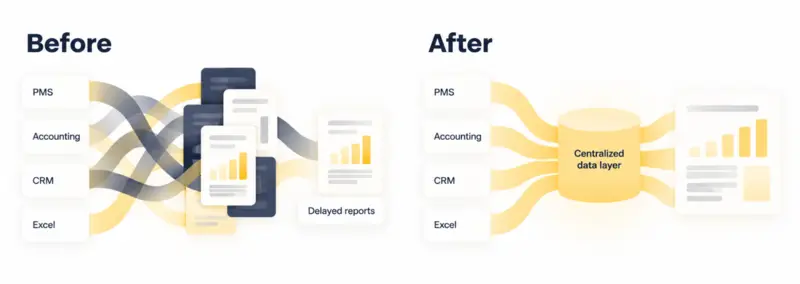
Before vs. After: How Portfolio Reporting Changes
The change is easiest to see as a shift in where the work happens.
Before
- Analysts spend time collecting and reconciling data.
- Reporting depends on individual workbooks and manual processes.
- Different teams may work from different versions of the same KPI.
After
- Data preparation happens in the pipeline.
- Metrics are governed centrally.
- Analysts spend more time interpreting performance than rebuilding reports.
This shift is often the substance of digital transformation services in real estate reporting. In many reporting modernization projects, the integration and data modeling work is more involved than the dashboard layer users see.
What Happens to Excel After the Transformation?
Excel can remain useful after the platform is live, particularly for underwriting, scenario analysis, and exploratory modeling. It remains flexible for testing assumptions and pressure-testing a new deal before those workflows become formalized.
What moves is the recurring reporting. The monthly and quarterly portfolio numbers, the ones that have to reconcile the same way every cycle, come off the governed platform instead of a workbook someone rebuilds by hand. The goal is to keep recurring reporting on the governed platform while preserving Excel for exploratory analysis and other work that benefits from direct modeling.
Common Mistakes When Replacing Excel-Based Reporting
Several implementation issues can undermine an otherwise well-designed reporting platform:
- Dashboards built directly on raw source data. Without an intermediate modeling and transformation layer, differences in identifiers, categories, and business logic can surface directly in the reporting layer.
- One-for-one spreadsheet rebuilds. Recreating existing workbooks as dashboards, without redesigning the reporting logic, carries the old problems forward.
- Undefined KPIs. Without agreed definitions for occupancy, NOI, and expenses, a shared dashboard still produces disputed numbers.
- Inconsistent identifiers. Unreconciled property and entity IDs break aggregation quietly.
- A separate pipeline per dashboard. Maintaining parallel pipelines increases duplication and creates more opportunities for definitions or transformation logic to diverge.
- Automating an unresolved process. Automation should follow agreement on metric definitions, mappings, reconciliation rules, and exception handling rather than reproduce unresolved manual logic.
Many of these issues can be avoided by defining the reporting requirements, data model, and KPI logic before implementation begins.
How ORIL Builds Custom Real Estate Investment Analytics Platforms
Building the dashboard is only one part of the work. The harder questions usually come earlier: which systems should supply each metric, how should property and entity records be matched, where should business logic live, and how should the resulting data be validated before it reaches an investment report?
ORIL approaches these projects by working through those decisions as part of the platform architecture. That can include:
- Connect source systems. Integrate PMS, accounting, CRM, property data, and Excel-based models using the interfaces available for each source, from APIs and scheduled exports to file-based ingestion. This creates a reliable flow of portfolio data into the reporting pipeline.
- Create a governed data model. Define entity relationships, canonical identifiers, and metric logic, then normalize source data and add validation and monitoring. This gives different reporting views a consistent foundation for portfolio metrics.
- Build decision-ready reporting. Turn structured data into role-specific investment dashboards with portfolio-to-property drill-downs, historical trends, variance analysis, and the KPIs relevant to each reporting workflow. This lets teams spend less time rebuilding reports and more time interpreting performance.
The exact architecture depends on the portfolio, source systems, reporting requirements, and existing technology environment. Some projects may center on integrating existing platforms; others may require a new data layer, custom application components, or migration work alongside the reporting solution.
As an end-to-end custom software development partner, we focus on the underlying data and software architecture rather than reproducing existing spreadsheets as dashboard screens.
From Reporting Automation to Portfolio-Level Intelligence
A clean, continuously updated data layer is useful well beyond faster reporting. Once portfolio data is integrated and governed, the same data foundation can support additional analytical workflows.
Historical consistency supports trend analysis. Governed metrics make forecasting and anomaly detection tractable. Reliable, structured data also provides a stronger foundation for later AI workflows, such as automated variance explanations, natural-language analytics, or an AI analytics assistant for property managers that answers operational and financial questions in natural language.
Industry research points the same way. Dealpath’s 2026 State of AI in CRE Investing survey of 103 institutional CRE investors found that 90% said data is limiting AI’s impact at their firms, despite 83% rating their data as AI-ready. The findings reinforce the importance of data infrastructure before expanding AI-driven investment workflows.
Turn Your Portfolio Data Into a Decision-Ready Dashboard
The dashboard is one part of the system most likely to change as reporting requirements and user needs evolve. Visualization tools get replaced, and reporting formats change with every new stakeholder. A well-designed data layer can remain useful even as dashboards, reporting formats, and downstream applications change.
That is what changes the economics. Initial implementation often carries a larger share of the cost because it includes source integration, data modeling, KPI definition, and pipeline setup. Once the core integrations and data model are in place, additional reporting views and analytical use cases can often be added without rebuilding the entire foundation, although each new use case still requires its own data and validation work.
This approach can make future reporting and analytical initiatives easier to extend because they build on shared integrations, models, and governance rather than separate datasets.


